Quick Fire: Ranking the 2018/19 NBL jerseys
The 'first ever' batch of First Ever NBL jerseys were released on Monday August 27 in anticipation for the 2018/19 NBL season. With the release only a number of hours old it's always an amazing aspect post jersey releases, seeing the hottest of takes from fans who either love of loathe their team's newest threads.
https://twitter.com/OlgunUluc/status/1033937611633483781
Below, we'll provide a non-unique insight as the hottest of hot takes have already been done for us, but a ranking system will be put in place to see the best NBL jersey for season 2018/19!
8. Melbourne United

Do we have a ticket M43? You just won the raffle! Interesting strategy here, bold, different, probably remarks that associate with the successful Melbourne United brand. However, may have just missed the mark with this one which looks like it would be a brilliant training jersey.
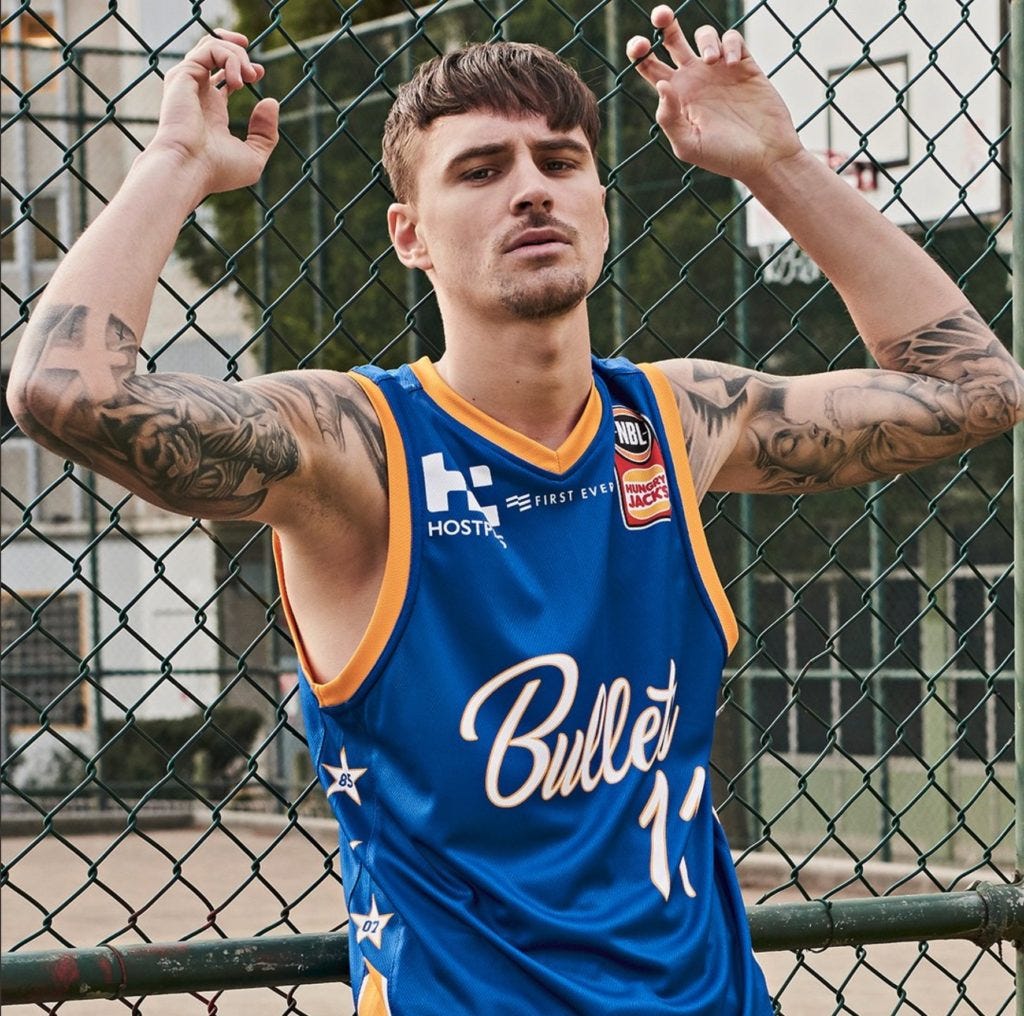
7. Brisbane Bullets

There's something about the combination of the yellow trim and that Philadelphia 76ers like font that they've tried to work with. A blue and yellow (blue and gold) combination has worked so well over a multitude of sports spanning decades of jersey manufacturing, however here it just doesn't seem to work in together.
6. Sydney Kings

Besides the fact that the great Andrew Bogut donned the purple and gold for the photo shoot, the Kings jersey is a nice clean cut which shows a touch of consistency which is an aspect that is super important further progressing through this thread. The purple seems real deep though, and it will be interesting to see how the yellow (away) jersey reflects back off their home threads.
5. Adelaide 36ers

Consistency is key and in year two of the rebrand the Adelaide 36ers have stuck to their guns to keep a nice, clean looking jersey. The red parts of the jersey really stand out and at times can really over power the crisp dark blue they have created.
4. Perth Wildcats

The Wildcats have been one of the league leaders in the jersey department for many years now, building on a base design and making slight differences to each year's design. This one is no different. Works well, although we're not too sure what's going on down the side of the uniform.
3. Illawarra Hawks

Illawarra has been yelling out for an all black uniform for some time now and they've played this one perfectly. Without the incorporation of their front of jersey sponsor quite yet, it looks super clean and the red and white trim compliments this perfectly.
2. Cairns Taipans

A big box ticked here for the Taipans as another year goes past with a consistent looking outfit. It certainly helps proceedings that orange is a stand out colour in its own right, and their front of jersey logo looks slick with the snake. The biggest winner of this jersey is the sides - the incorporation of the snakeskin further improves their slick uniform.
1. New Zealand Breakers

Arguably the winner in this department last season, the Breakers have further pushed the boundaries across the Tasman with fresh new typography and the incorporation of their on-going and loyal front of jersey sponsor. Further fitting the bill, the Breakers continue their tradition with the watermark down half the jersey, as well as including just enough light blue areas to make the jersey pop.
